
Fantasy Map Review IV: Forgotten Realms
For links to all instalments in this series, go here.
For the fourth instalment is yet another iconic map piece - Faerun. I've gone for the 3rd edition one as that is probably the most widespread one out there and also (imo), the best.
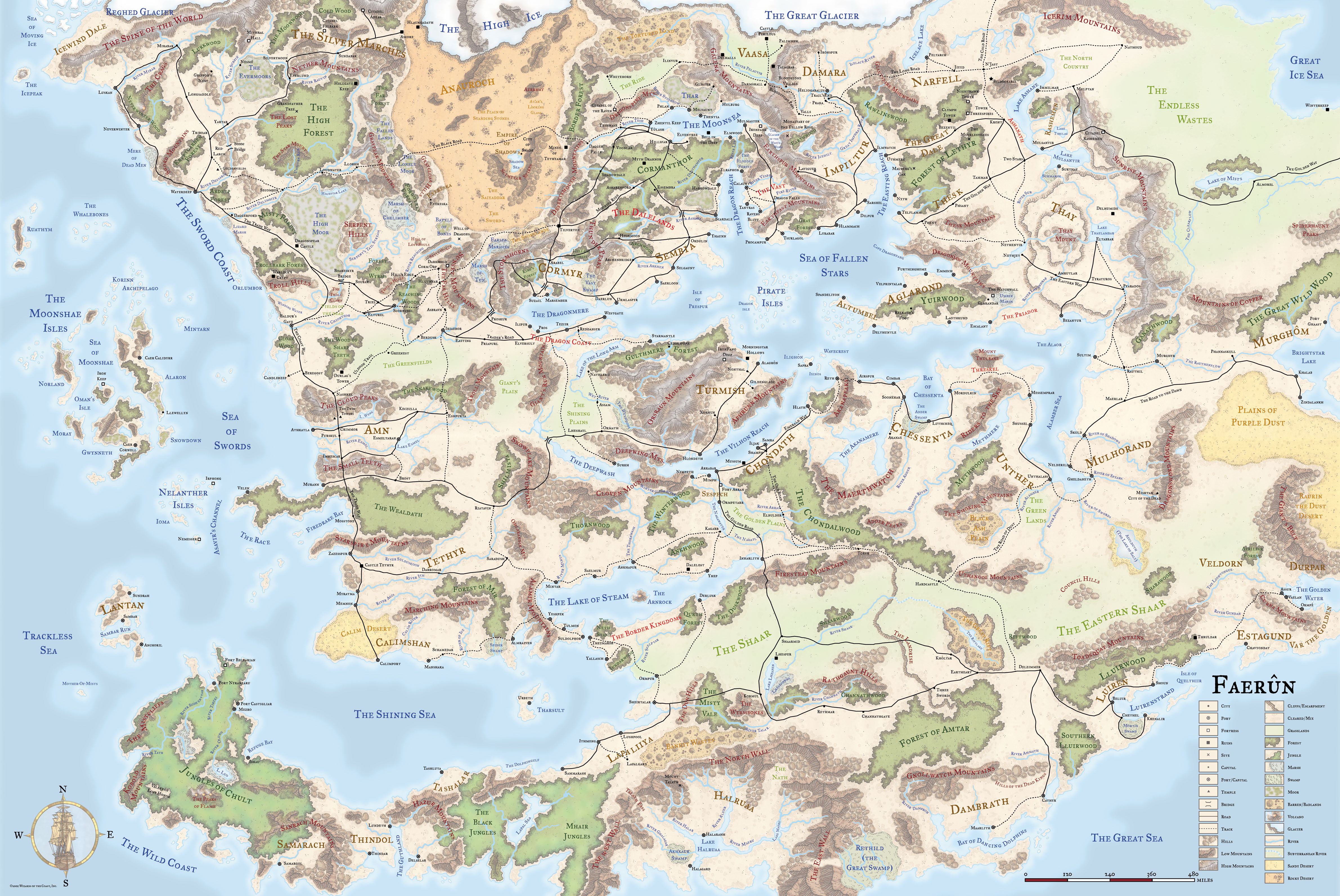
Ed greenwood does a lot of the same things right as Gygax did with his Flanaess map. He understands that placement of seas as separators; points that cultures congregate around; and routes that open up and connects different adventuring areas really makes a difference to a good map.
He nails it with the Sea of Fallen Stars and the multitude of bays, lakes and reaches that feed into it. One boat can set sail in the sea of salt in Mulhorand in the deep south and meet up in the Sea of Fallen Stars with a vessel that started from the tortured lands near the great glacier, passing through Damara, Vaasa and Impiltur before entering the sea proper. Great stuff.
What is really striking about this map is the scale of it. It feels larger than the Flanaess and Ansalon (nevermind diminutive Middle earth) - There is a clear 'centre' in and around the Heartlands (though this is really just the northwestern corner of the map) and from there it seems there is no end to new lands around the next mountain range. Greenwood has done great work to achieve this sense of exploration and making his main adventure area, the Heartlands, sizeable and a setting in its own right, yet just a corner of the actual setting is a great move that not only informs us something about the nature of the heartlands, but tells us the Realms really are endless with opportunity for adventure and exploration.
On an unrelated side note, since this is a map review, this is also what I liked about the 2nd edition boxed set. It managed to convey the sense of distance, myth, rumour and wonder the further you went from the Heartlands. The 3rd edition book, while more coherent and exhaustive, somehow made the Realms feel quite small and explored in comparison.
Anyway, back to the map: Artistically, it's not very good. This is true of all editions sadly. Take a look at the 1st edition map:

Looks like a first draft drawn in MS Paint. No thanks.
2nd edition wins some in terms of stylistic flavour
 But the colour compositions is dull and the contrast too sharp.
4th edition makes a decent attempt at flavour with a more grainy 'painted' map.
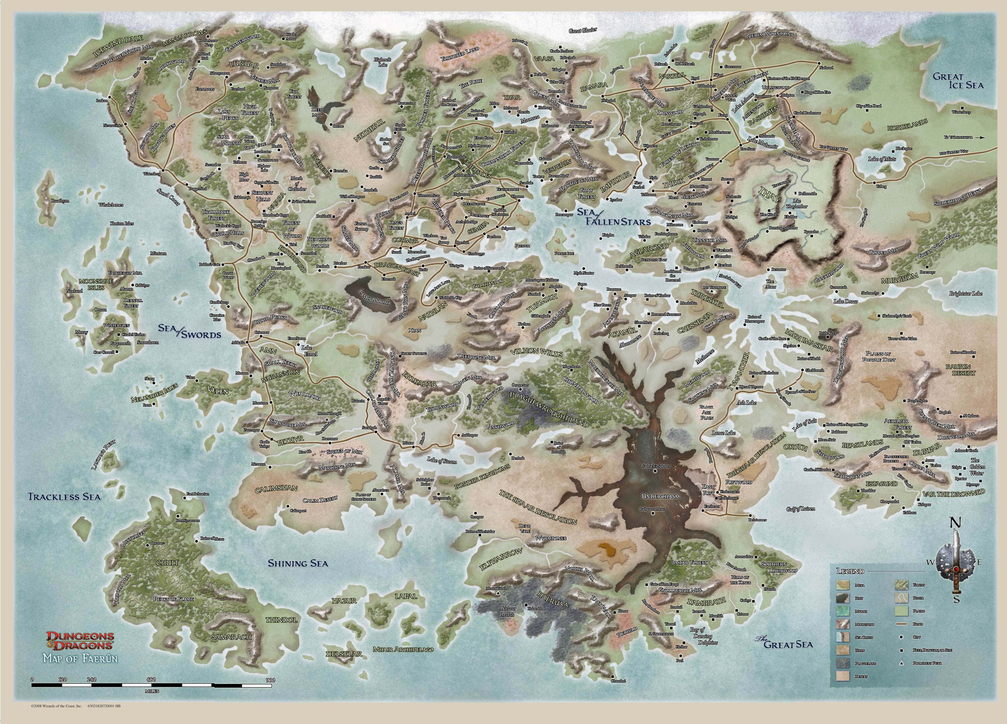 But in the end falls flat with a colour palette that is too bland and indistinct and a style that is too obviously digital.
At least the 3rd edition map gets colour composition and contrast right - Too bad the actual drawings are about as evocative as a box of coal. In the end, it detracts from the substance as well, as I am frankly less interested in studying the map and its contents in more detail. And I am left with the impression that there are areas drawn that could have been evocative with another style that just aren't in this map.
Style: 2/5
Substance: 5/5
For the fourth instalment is yet another iconic map piece - Faerun. I've gone for the 3rd edition one as that is probably the most widespread one out there and also (imo), the best.
Ed greenwood does a lot of the same things right as Gygax did with his Flanaess map. He understands that placement of seas as separators; points that cultures congregate around; and routes that open up and connects different adventuring areas really makes a difference to a good map.
He nails it with the Sea of Fallen Stars and the multitude of bays, lakes and reaches that feed into it. One boat can set sail in the sea of salt in Mulhorand in the deep south and meet up in the Sea of Fallen Stars with a vessel that started from the tortured lands near the great glacier, passing through Damara, Vaasa and Impiltur before entering the sea proper. Great stuff.
What is really striking about this map is the scale of it. It feels larger than the Flanaess and Ansalon (nevermind diminutive Middle earth) - There is a clear 'centre' in and around the Heartlands (though this is really just the northwestern corner of the map) and from there it seems there is no end to new lands around the next mountain range. Greenwood has done great work to achieve this sense of exploration and making his main adventure area, the Heartlands, sizeable and a setting in its own right, yet just a corner of the actual setting is a great move that not only informs us something about the nature of the heartlands, but tells us the Realms really are endless with opportunity for adventure and exploration.
On an unrelated side note, since this is a map review, this is also what I liked about the 2nd edition boxed set. It managed to convey the sense of distance, myth, rumour and wonder the further you went from the Heartlands. The 3rd edition book, while more coherent and exhaustive, somehow made the Realms feel quite small and explored in comparison.
Anyway, back to the map: Artistically, it's not very good. This is true of all editions sadly. Take a look at the 1st edition map:
Looks like a first draft drawn in MS Paint. No thanks.
2nd edition wins some in terms of stylistic flavour
4th edition makes a decent attempt at flavour with a more grainy 'painted' map.
At least the 3rd edition map gets colour composition and contrast right - Too bad the actual drawings are about as evocative as a box of coal. In the end, it detracts from the substance as well, as I am frankly less interested in studying the map and its contents in more detail. And I am left with the impression that there are areas drawn that could have been evocative with another style that just aren't in this map.
Style: 2/5
Substance: 5/5


Comments
Post a Comment